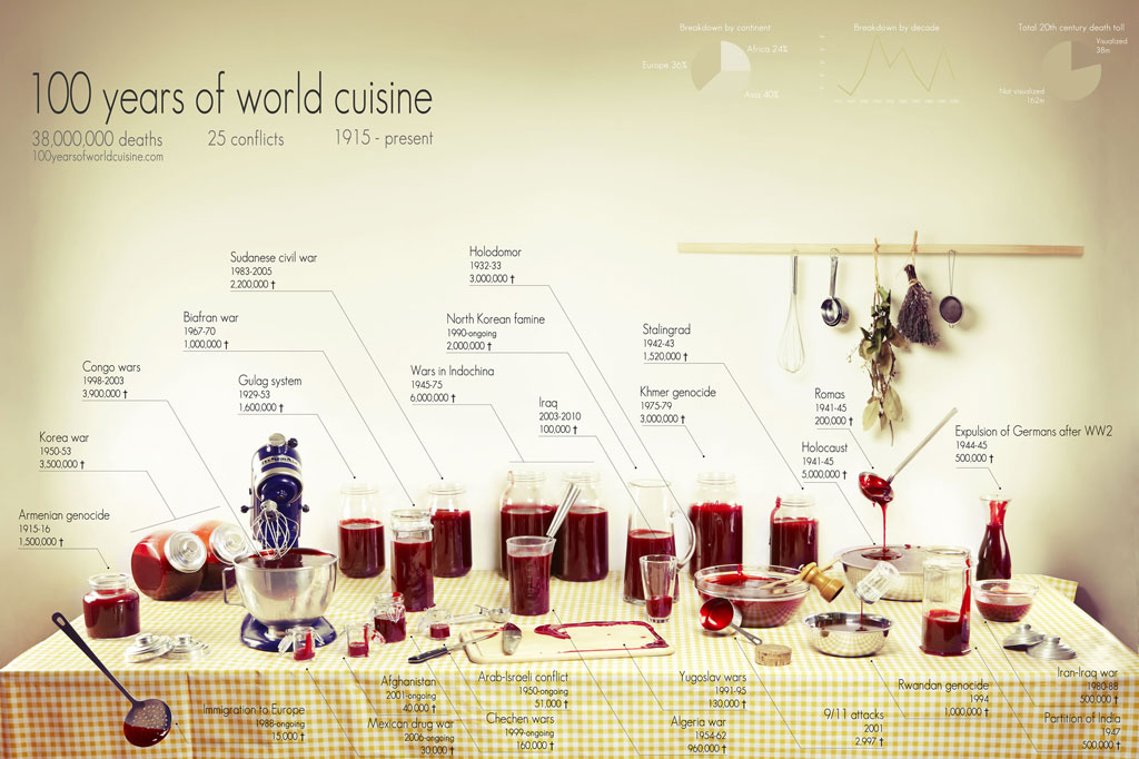
Ten casualties. Ten million casualties. Our understanding of conflicts is often nothing more than a handful of digits, the more precise, the less meaningful. The anchor’s tone remains the same when talking about major wars or isolated outbursts of violence. The horror lays hidden beneath the rigidity of numbers. Figures give us knowledge, not meaning.
We wanted to put a picture on these digits. A shocking, gory picture, like the reality of war. We wanted to give context, like a scale on which we could visualize each conflict next to the others.
(Source)
Very interesting representation. Really puts things into perspective.


Comments
4 responses to “Proportional Blood Spilled In Conflicts Visualized”
No way that 100,000 people have died in Iraq. I doubt that many people have emigrated from Iraq.
Sadly yes, there’s actually an organization logging the number of deaths by counting bodies in morgues, and the figure is actually around 122k now, not including the ~25k dead US soldiers and ~50k iraqi combatants
With how long the war has gone on now? Dont be too suprised, that’s a grand total over time. I’m actually a little suprised that number isn’t upwards of 300k whatwith how long it’s been :/
And this really speaks for the ol “WHAT IS A MAN” speech from Dracula. Blood, death, and war. Totally relevant :D