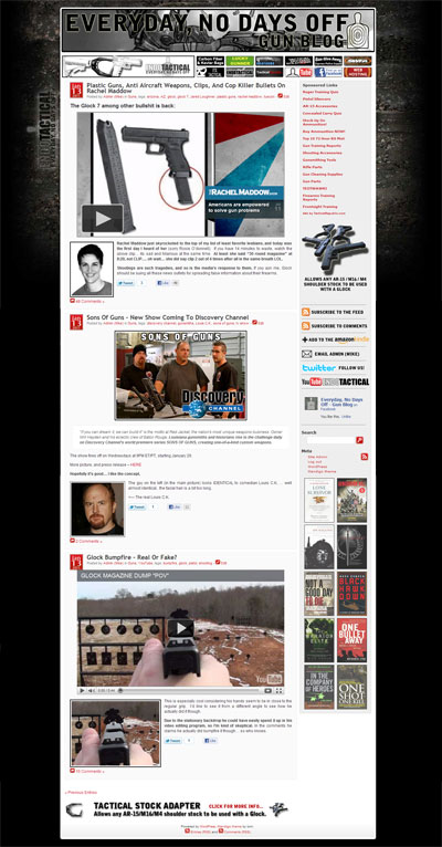
(The above picture is for posterity)
Well, I’m finally done.
I really like the whole design process, so I had a blast redoing the site. I’d have to say I like doing graphics better than coding though, less can go wrong; I didn’t run into many issues on the code side of things though either. I can’t say enough good things about the WordPress design framework I used called Thesis. If you want to customize the base theme as heavily as I did you will still need to know how to code, but it gives you a great platform with great SEO to build off. The support you get from their private forum is phenomenal too.
That said, every time I make a website I can’t help but wish I had some sort of tangible representation of Internet Explorer, that I could beat with a bat at least once a day. Internet Explorer is the WORST browser known to man, and requires so much specific tweaking just to get things looking half decent. Please, if you are on the internet more than 5 minutes a year, do yourself a favor and install Google Chrome.. or at the very least Firefox. I don’t have much experience with Safari, but as far as I can tell it’s cool too.
If you are experiencing any bugs let me know and I’ll do my best to iron them out.
Let me know what you think!
-Mike
Everyday, No Days Off


Comments
18 responses to “Everyday, No Days Off – Site Redesign Trials And Tribulations”
Awesome! I kind of liked the darker color theme of the old one. But this looks great! I caught you right as you posted it! I’m kind of new to the blog. But I don’t know. I’m kind of indifferent. Layout is better, but the color, not so much.
Thanks! Yea it was a toss up between light and dark for me too. I’m thinking of making a dark style sheet that users can select if they want to.
I like the new layout but like Austin I preferred the darker one. As a web designer I can tell you that I feel your pain of having to deal with IE. Its been a few times I thought of taking my laptop and using it for target practice (using proper grip of course).
ugh, yea doing web design for a living I think i’d be too stressed dealing with IE. Everyone should just band together and decide IE needs to evolve or it won’t be supported.
Just needs a dark background on the article itself, to separate it from the rest of the page.
Hmm good idea.. I’ll test that out. Like I said to Austin in the above reply, I was also considering making an alternate darker style sheet that users can select instead if they wish.
I would install Chrome if it properly obeyed target=”_blank”, and I would install Firefox if it did not have a history of breaking my entire computer.
Aside from that, liking the clean lines, but it might need a bit more definition…
Thanks Linoge. I agree, it’s funny Chrome ignores _blank, but you can always just hold shift down when you click a link to have it opened in a new window.
Very nice. Lots of attention to detail. I like the lighter look!
Thanks Mark!
My only recommendation is to have a site map of all your previous posts listed by month and year. You know, a way to see what you posted in august of 2008. And an easier way to browse your categories you post your posts in. Just some thoughts.
Thanks Daron, i’ll keep that in mind. Honestly I didn’t know anyone ever browsed the categories / links / archives areas.. I figured people just clicked back through the pages.
Looks good Mike!
Thanks!
Looks great. I like that “fire to the top” button at the bottom of every page.
Thanks. That’s one of my personal favorite parts too.
Really nice. Nevertheless, the second line of titles is not really legible on safari.
Thanks John! I’ll have a look into that safari issue when I get a chance.