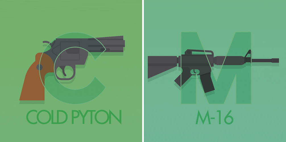
Very poorly done, I thought you guys would get a kick out of it:
Check out the full weapobet over at Behance.
Not only are the artistic representations of the guns terrible even from a vector graphic standpoint, but the artist (and I use that term loosely) flops back and forth between using manufacturer names and model names which is weak.
Also, wtf is a Cold Pyton? I could go on about minor mistakes all day to do with grip angle and over all look, but another one I know you guys will point out is the M-16 is actually more like an M4… which I suppose still works for the letter M.
Thoughts?


Comments
16 responses to “Weapobet – Weapon Alphabet”
Degtyarev for D? DESERT EAGLE YOU FUCKING TROLL! GOOD GOD!
how much you want to bet this guy typed ‘gun’ followed by a letter into google search and went with the first clear pic he got?
Can spell Degtyarev.
Cannot spell “Colt”.
Sigh.
The names are wrong and designs sloppy.
( •_•)
So was the artist being creative…
(⌐■_■)
…or just fucking retarded?
YEAAAAAAAAH!!!!
Epic emoticons Poppy!
hahaha.. cold python !! thanks for pointing that out.. :: fael ::
Its actually Cold Pyton…. he went to the trouble of misspelling both words for us.
From navigating around the website it says the “artist” is from Barcelona, Spain.
Nice idea, however the execution leaves a lot to be desired for…
Who put an FNC Trigger Group and pistol grip on that M4?
The Cold Pyton??? *GASP* Isn’t that the magical frost-enchanted revolver in .454 +P+ that Ser Chuck Norris used to slay the two headed dragon of Papau New Guinea?
Or just maybe a grevious spelling error…oh well..
My wife made a partial set for our kids…
https://fbcdn-sphotos-a.akamaihd.net/hphotos-ak-snc7/392235_10150441771584120_589424756_n.jpg
That’s awesome!
nice.. these are way better
nice.
it’s a european. gotta cut ’em a certain amount of slack for trying.
Other than the fact that whoever did this cant spell and doesnt know his guns, the art itself isn’t bad. It’s minimalistic and geometrically styled, so dont bash it just because its not photorealistic. Just sayin, it’s a design, not a diagram.
FYI the original says COLT not COLD http://www.behance.net/gallery/WEAPOBET/2952191 so…..