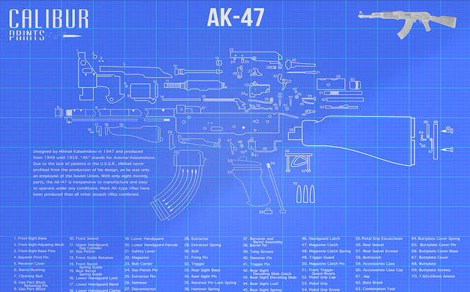
What a trainwreck… you know what they are supposed to represent, but you have to really put logic aside and use your imagination:
Sweet lord those are all so terrible. What is even funnier is that there is a kickstarter campaign that is getting dangerously close to being funded, and has 14 days left to go.
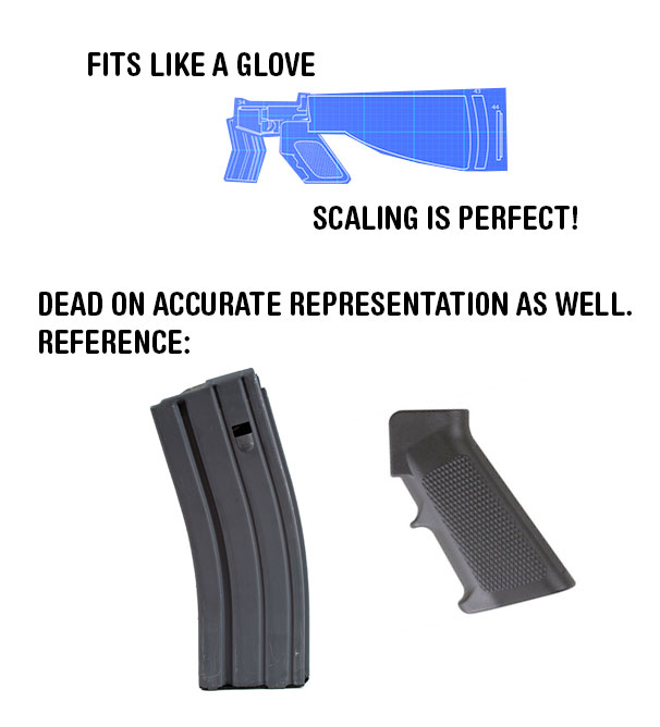
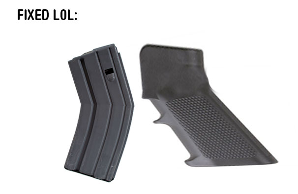
I could do a bunch of side by side comparisons with pictures of the actual thing and his “representation”, but I really don’t want to waste my time and insult the intelligence of you guys. If you have ever seen any of these guns, disassembled or not, your first thought will be “WTF is this?”. You know what, screw it… just a quick photoshop for some Friday morning laughs for you guys:
Oh Wait.. never mind what I posted were just fake AR-15 magazine and grip pictures to troll you guys… here are the real pics:
Most of my posts don’t have any kind of back story but here’s the story behind this post… the kid who runs this thing, “Justin James” emails me an unimpressive form email with a short background on his project and links to his Kickstarter campaign. Against my better judgement I wasted my valuable time and sent him a nice reply. I say “against my better judgment” because I feel like when I try to help someone by offering them constructive criticism which will help them avoid potentially falling flat on their face, it at least deserves a reply back like “Hey thanks for your time Mike, I’ll take what you said into consideration.” Well, this went down over a month ago and I still never got that courtesy reply, so now he gets this post.
Here is the email I sent him. I think it was fair, not to mention helpful:
Hey Justin,
Interesting idea, the execution is not at all my style though. The obtrusive branding, blue background, grid print, and “artistic” not even close to actual representation of the firearms all kill it for me.
Also, $15K? There are too many unanswered questions. Why do you need that much money? What type of prints are these going to be? What type of paper are you using? The startup costs to print posters just are not that high… any reputable print shop will even just print you a handful of prototype ones for the less than $100 just to cover their screen fees, time, and what not.
The idea is solid but I really think you need to think this one through some more, and look into heavily refining the drawings.
Best of luck with the Kickstarter,
-Mike
CLASS IS IN SESSION. I forgot to mention to him how appalled I was that his logo has the entire cartridge (not just the bullet) cutting through the letters. Oh well now he knows. There are a lot of small details besides the ones in that email that really annoy me too… take the AR-15 “drawing” for instance. The AR-15 picture in the top right has carbine gas and an adjustable stock… why does the “drawing” feature a different version of the AR (if you can even call that thing an AR like I touched on earlier haha)? Oh and you’re going to explode everything else out but keep the trigger assembly inside the lower? Too hard to draw I guess? Rookie move. Step your game up son. I can’t believe your dad (who you say in the Kickstarter video was a marine) didn’t ream you out for bastardizing these firearms.
Calibur Prints has a website too, but there isn’t anything on it that isn’t on the Kickstarter page linked at the top of this post. Placeholder for future derp I suppose.
This could be a social experiment where the object is to convince people these prints represent the firearms just because a perceived authority, the “designer” (and I use that term loosely) says so.
 Something tells me this blog post wont make the “Press” section of his Kickstarter campaign haha. If this project actually reaches it’s goal, I’ll LOL so hard.
Thoughts? Is there that much of a drought in the gun related prints market, that people are willing to throw money at subpar garbage like this?


Comments
45 responses to “Calibur Prints – The Most Awful Firearm Drawings I’ve Ever Seen”
I dont see what you are complaining about. The AK47 looks accurate.
http://images.hobbytron.com/NT-UM604-lg.jpg
see?
hahah perfect
LMAO “hundred of hours graphic designing”. My fuckin’ niece could draw a better disassembled AR than that guy. Also $15,000? You’re shitting me.
yeah……no.
They’re so bad only a libtard could be responsible!
I think it’s another scam to screw money out of gun owners and feed the ill gotten gains into Bloomberg’s Illegal Mayors Against Legal Guns (IMALG).
“Art”
I think I see a shoulder thing that goes up somewhere in that AR15 drawing. I absolutely love how each part is drawn too a different scale. How could that hammer even fit in a Garand receiver, not to mention the shape and size of the “stock.” Those things are an attack on my sense of sight.
This guy clearly has no background in any sort of drafting or technical drawing.
Opportunistic money grabber extraordinaire! I salute you Justin Janes, for finding $10,000 worth of idiots to sign up for this.
cant wait to see a drawing of a model 29…..(eye roll)
What the fuck is up with that M1 Garand? It’s like SBR’d and fattened around the grip. How the hell would you even hold it, let alone hold it while shooting it?
From the Kickstarter FAQs:
“I noticed that your logo inaccurately shows a bullet being shot with the casing still on.
Yes, that is absolutely correct. In reality, the brass casing would not still encase the bullet once it has been fired. The Calibur Prints logo was designed to be aesthetically appealing, rather than realistic.”
Apparently, unlike the logo, the gun diagrams themselves weren’t designed to be realistic OR aesthetically pleasing….
ROFL
ROFL I missed that on the page… that’s probably the funniest thing I’ve heard in a long time.
This gives me an idea for a new blog: worst kickstarter/crowdfunding projects of the week.
Good G-d those are atrocious. Compare that to this gentleman’s handiwork:
http://www.dogfightink.com/prints.html
Now that is proper art! I have bought several of this gentleman’s decals, and his prints are awesome. Forgo this foolishness and head over to Dogfight Ink for the real deal.
Not bad! I don’t really care for the way the parts are laid out, but at least they are accurate unlike this clown show.
Fucking give this guy $15k
This is the problem with kickstarter in a nutshell. People have turned it into “give me money for crap or nothing” and leave people with no way to get their money back. And kickstarter is full of idiots who will kickstart anything and this kickstarter proves it.
Well done mike.
Derpy. 323 people think it’s great though LOL Kickstarter. I wonder how many of them follow ENDO and will try and cancel?
Jeeeez. If he can get 15K for shit like that, I wonder how much suckers would pay for what I’ve done with 3D CAD models…
Why not just print off a real AR-15 blueprint on a plotter at Kinko’s, and put it in a frame? You’d get a better quality product for $5.
Better off just hanging a fucking tek mat on your wall. (could frame it too for kicks)
Someone email the owner [email protected] and tell him he done goofed and is up on ENDO.
If this dude made a poster of that AK but unexploded with same scale, then I would buy that.
By same scale i mean same wrong scale he used. Id take a picture of that discombobulated franken AK for the lulz.
LOL
For a high school project or something then this is fine… But for serious commercial purposes??? Mike’s email to the fellow was nice, helpful and accurate!
Serious question – WTF are they? Is it wallpaper? A poster?
Posters.
lol at the 1911 barrel having the girth of a 30mm round.
I really need to come up with a Kickstarter project. I’m thinking either a smooth river rock with some seagull shit on it* or a collection of paper clips in an old mayonnaise jar.
*Will require clamshell packaging
haha genius!
My husband shared this with me on facebook and being an avid shooter I had to come see for myself. Has Justin ever even seen any of these guns, or is his going by video game renderings or his imagination?
Funny thing is, the video game models and images are usually pretty darn accurate…it’s got to be in his head…
I initially thought that this guy has no personal, in-person experience with these guns. Then I watched the video and realized that he probably does, but drawing them and fitting them properly to scale would be hard, so he just half-asses it and calls it “artistic license” or some shit.
I’m just glad there aren’t any bleeding-heart bitches on this page saying, “If you think it’s so easy, then you do it!” I know my limitations. I can’t draw for shit, so I wouldn’t bother to do something like this. Just because he tried, that doesn’t mean that this jackass should be rewarded just because he’s too stupid to realize his efforts suck.
I know for a fact that it isn’t hard.
Open a new artboard in illustrator, blue square, add white grid. Insert text copied from Wikipedia. Find photos of parts on google or take photos of your firearms or those of a friend. Import, trace, arrange to be asthetically pleasing.
Time consuming…maybe, if you want to be 100% exact. But he likely put more time into his videos than illustrating the posters that he is advertising in them.
I think he got confused on that 1911, I think he meant to write Tokarev…..
Dont sully comrade Tokarevs pistol with that “artistic” mess.
I mean seriously, I draw like Picasso (read: like shit but I call it art and everythings :) ) And even I draw better(I like to draw….alot)
This was on KitUp a month or so ago…this is what I said then:
“Love the idea, and I would hang them all over a man cave. BUT, the designer and gun enthusiast in me hates the misshapen parts. They seem cartoonish and distorted…something that doesn’t fit in with the demographic that will be buying this. Grab your DSLR, take pictures of the individual firearm parts (borrow one from a range buddy if you have to and offer him a free print or something) and outline them in illustrator.
It’s an easy job and a great idea…just needs a few tweaks. Personally I would prefer a white on black color scheme as well…maybe on the second production after you’re already a millionaire?”
Now, I say give me $5k and I’ll do accurate outlines, multiple color schemes and 10-20 different firearms. No idea what I’ll charge for the prints though…
Now I’m pissed enough I may put a set together myself to show its ease… I need to clean one of my AR’s anyway…
Looks like he took the advice. The designs have been updated and look MUCH better now.
Yeah, they do look better. I still don’t want one. And he still didn’t break out the trigger group on the AR.
He also put a lefty upper receiver on the print too, probably just so he can put the ejection port & trapdoor on there. Personally I think if an artist has to contort a subject just for the beauty shot then it’s all for naught. Probably irks other people a lot less and that sort of receiver is available… kind of. To my knowledge no one actually makes a lefty upper without a flat-top.
To each his own. I’m already soured by the guy’s incredibly poor first attempt. It’s reasonable to expect people to get better over time but he clearly had the talent (or resources) to make it right the first go around and slacked on it hardcore. To me that’s just a sloppy work ethic and I wouldn’t invest in a product like that knowing that.
That and there’s just something really “meh” about those designs. Nothing special to be seen, no real artistic merit. The artistic merits of these pieces withstanding all that remains is technical/educational appeal, but why pay for that when it’s abundantly free with a quick Google search?
Try harder, Calibur Prints.
Yea basically just the worst. I see it reached funding on Kickstarter too. Hilarious.
This is more along the lines of something I might buy – much more accurate. Still needs some work, but makes a lot more sense now.
Meh… they definitely look a bit better. Still very bush league though.