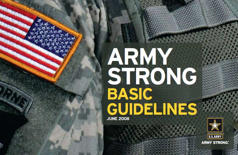
A 66 page document outlining the minutia of their graphic design expectations:

The PDF is available – HERE
Interesting to go through if you have an interest in graphic design. If you don’t… then probably not so much.
The length is not surprising considering the same government requires a 26 page document outlining the way to prepare oatmeal cookies and chocolate covered brownies.


Comments
14 responses to “U.S. Army Graphic Design Guidelines”
Excellent post. As a would be graphic designer I love this stuff.
Dig it!
They really went through a lot to make this. Good things happen when you hire a marketing firm.
Interesting stuff. Thorough branding guide, but guides this extensive are the norm. As someone who works in video production, I see a lot of branding guides and it’s often ridiculous how detailed they are. It is interesting to see their rules regarding the co pattern though. I’d have never expected that.
Very interesting. However, I don’t really see the point — are they holding a competition or looking to hire new designers? It seems like giving away your techniques is pointless otherwise. Being a graphic designer myself, I see a lot of this stuff, but usually only when companies are looking to hire new designers and want to test out peoples skill.
Anyone know if there was a reason for them releasing this stuff?
-Davis F.
They are looking to replace the digital camo pattern because it wasn’t working as well as they thought it would. You can google an article about that probably.
They’ve already found a replacement, thats why we can see the requirements for it. Its called MultiCam, heres what it looks like:
http://www.armytimes.com/xml/news/2010/02/army_multicam_030110w/021710at_multicam_2_800.JPG
Article about it:
http://www.armytimes.com/news/2010/02/army_multicam_030110w/
Multicam’s been around for awhile. And it’s been used in Afghanistan by Rangers and SF for more than a couple of years (in Afghanistan). That article only indicates that it will be used in Afghanistan, not that it will be replacing the ACU as the standard Army uniform. It sounds kind of like when I was in Afghanistan and we wore DCU’s, but our standard uniform elsewhere was still the woodland camo BDU’s.
I would imagine they produced this for the designers that they utilize to produce their ads. I would say that in general the graphic design crowd, and other forms of artists, aren’t really the military type, so I don’t imagine the Army is doing all of their design stuff themselves. And the Army demands uniformity in everything, even their ads, so they’re not going to give an ad agency/designer free reign to come up with their own take on what the ad should look like.
I guess I didn’t really read your post well enough before responding the first time. Pointless? Maybe. But, it’s not classified information, it was produced by the federal government, so it’s Public Domain. We, the taxpayers, paid for it.
I’m not 100 percent sure, but I believe they are required by law to release documents like this to anyone who asks after a certain amount of time.
I was going to share this earlier, but I realized that it was on an external hard drive that was in a box of stuff at my father’s house, so I had to run out and get it today. I made this back in 2003 after getting back from Afghanistan as a joke on my platoon sergeant. Obviously, this was back when they were still using the “Army of One” slogan with ads with this graphical layout.
http://www.mediafire.com/i/?ox02if3nisbfip8
hahah that looks very legit!
I put it on the bulletin board at our company and people kept going up to him asking about it; they thought it was real. I guess they didn’t read it. Everyone who knew it thought it was hilarious. He always used to ask and answer questions like that. “Can you [do this]? Yeah, but it that the best idea? No.” And he was a coffee snob. My first field exercise with him was at NTC, and at one point he whipped out his MSR backpacking stove, some coffee he had brought from home, and a French press! To this day, one of my most trusted friends.
MAC21500..the uniform looks nice thou..