
Fake reCaptcha – Photoshop Tutorial For Trolling:
- Take screenshot of the reCaptcha you are trying to troll (even type your troll words underneath before hand, for authenticity).
- Paste it into Photoshop, zoom in on the reCaptcha and delete it or color over it with white
- Select the type tool and change the font to “Times New Roman”, and change the style to “Bold”
- Type your trolling word(s) then use Warp Text (Layer –> Type –>Warp Text) to give a distorted look. I like the style “twist”.
- Flatten the image (Layer –> Flatten Image)
- Add a slight blur to the text. I prefer Gaussian (Filter –> Blur – Gaussian) or Motion blur.
- Apply the Photocopy filter (Filter –> Sketch –> Photocopy) and even the “Graphic Pen” filter (and blur slightly for effect), Basically just fool around with the settings until you get it how you want. You can use other filters and combinations of filters to achieve similar effects.
- reCaptcha troll word(s) complete.
For the “ink spill” variation reCaptcha, you just need to draw a shape over top of your word and layer via copy, then invert the colors by clicking Layer –> New Adjustment Layer –> Invert.
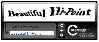
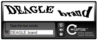
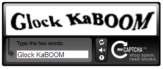
Here are the ones I made up for use on your favorite site (300 px x 57 px – Drag and drop into your screen shot):


Comments
15 responses to “Fake reCaptcha – Photoshop Tutorial For Trolling”
That’s pretty clever. I didn’t try making one, but in your instructions – after you warped the text you flattened the image before blurring. You’re saying to “add a slight blur to the text.” If you flatten the image at that point, aren’t you going to end up with just one layer, and you’ll be blurring everything, not just the text? I think in order to preserve the clarity of that background layer (the CAPTCHA box), you could just rasterize the type layer and blur it only.
Good point.. I actually drew a marquee around the recaptcha white box area and click “layer via cut”… that way when you blur it etc.. you are only performing it on the text and the white background. Just rasterizing the text (with no white background) does not work the same for some reason.
Ah, I see. I’ve learned to avoid flattening an image if at all possible. I think the reason it’s not working the same is because after you’ve flattened it you’re blurring white into the text as well as blurring the text.
Whatever you did, it worked well.
yea I think you’re right. I agree… I’d never flatten unless completely necessary.
AR JAM
haha good one
I tried typing the highpoint one, but my fingers just couldn’t type beautiful in front of it.
haha yea it was tough to do
To keep things legal, you should change this blog’s name to “Every Day, One Week Off”. Everything OK?
Many folks are wondering if all is well?
+1
Same!
…bump?
+2 Yea what the heck? Don’t make me find a different way to kill time at work! heh
Hi! im SO glad you made this- now i can finally make one of these things! :3